


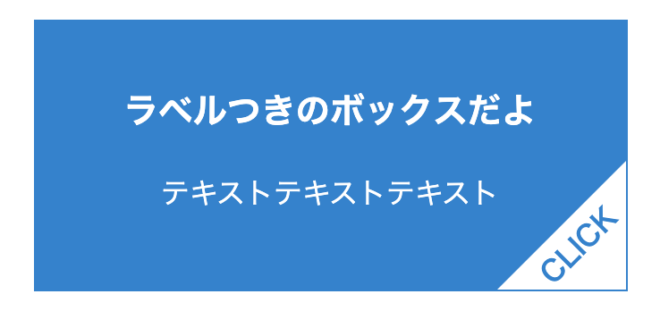
どんなやつ?
こんなやつ
作り方
- HTML
<div class="block">
  <div class="title">ラベルつきのボックスだよ</div>
  <p>テキストテキストテキスト</p>
</div>- CSS
<style>
  .block {
    color: #FFF;
    border: 1px solid #0082D2;
    background: #0082D2;
    width: 300px;
    padding: 15px;
    margin: 10px;
    text-align: center;
    position: relative; /* 必須! */
  }

  .block .title {
    font-weight: bold;
    font-size: 1.2rem;
    margin: 20px auto;
  }

  /** ラベルの背景部分 **/
  .block:before {
    content: "";
    position: absolute;
    bottom: 0;
    right: 0;
    border-top: 4.5em solid transparent;
    border-right: 4.5em solid #fff; /* ラベルの背景色 */
  }

  /** ラベルの文字部分 **/
  .block::after {
    content: "CLICK"; /* ラベルの文字テキスト */
    position: absolute;
    bottom: 13px;
    right: 0;
    transform: rotate(-45deg); /* 文字の角度 */
    color: #0082D2; /* 文字の色 */
    font-weight: bold;
  }
</style>
ざっくり解説
ラベルの場所を変更したいとき
ラベルを右下ではなく他の角に変更したいときは、
:before, ::afterの位置の指定部分と文字の角度を変更してあげる
- 左上
- .block:before { top: 0; left: 0; border-bottom: (省略); border-left: (省略); }
- .block::after { top: 13px; left: 0; transform: rotate(-45deg); }
- 右上
- .block:before { top: 0, right: 0, border-bottom: (省略); border-right: (省略); }
- .block::after { top: 13px; right: 0; transform: rotate(45deg); }
- 左下
- .block:before { bottom: 0; left: 0; border-top: (省略); border-left: (省略) }
- .block::after { bottom: 13px; left: 0; transform: rotate(45deg); }
- 右下
- .block:before { bottom: 0; right: 0; border-top: (省略); border-right: (省略); }
- .block::after { bottom: 13px; right: 0; transform: rotate(-45deg); }
四隅に表示したサンプル
- DEMO
ラベルつきのボックスだよ
テキストテキストテキスト
ラベルつきのボックスだよ
テキストテキストテキスト
ラベルつきのボックスだよ
テキストテキストテキスト
ラベルつきのボックスだよ
テキストテキストテキスト
ソース (ちょっと長いよ)
- HTML
<div class="block-list">
  <div class="block top-left">
    <div class="title">ラベルつきのボックスだよ</div>
    <p>テキストテキストテキスト</p>
  </div>
  <div class="block top-right">
    <div class="title">ラベルつきのボックスだよ</div>
    <p>テキストテキストテキスト</p>
  </div>
  <div class="block bottom-left">
    <div class="title">ラベルつきのボックスだよ</div>
    <p>テキストテキストテキスト</p>
  </div>
  <div class="block bottom-right">
    <div class="title">ラベルつきのボックスだよ</div>
    <p>テキストテキストテキスト</p>
  </div>
</div>- CSS
<style>
  .block-list {
    display: flex;
    flex-wrap: wrap;
    justify-content: center;
  }

  .block {
    color: #FFF;
    border: 1px solid #0082D2;
    background: #0082D2;
    position: relative;
    width: 300px;
    padding: 15px;
    margin: 10px;
    text-align: center;
  }

  .block .title {
    font-weight: bold;
    font-size: 1.2rem;
    margin: 20px auto;
  }

  /** ラベル背景の共通スタイル **/
  .block:before {
    content: "";
    position: absolute;
  }

  /** ラベル文字の共通スタイル **/
  .block::after {
    content: "CLICK";
    position: absolute;
    font-weight: bold;
    color: #0082D2;

  }

  /** 左上のラベル背景 **/
  .block.top-left:before {
    top: 0;
    left: 0;
    border-bottom: 4.5em solid transparent;
    border-left: 4.5em solid #fff;
  }

  /** 左上のラベル文字 **/
  .block.top-left::after {
    top: 13px;
    left: 0;
    transform: rotate(-45deg);
  }

  /** 右上のラベル背景 **/
  .block.top-right:before {
    top: 0;
    right: 0;
    border-bottom: 4.5em solid transparent;
    border-right: 4.5em solid #fff;
  }

  /** 右上のラベル文字 **/
  .block.top-right::after {
    top: 13px;
    right: 0;
    transform: rotate(45deg);
  }

  /** 左下のラベル背景 **/
  .block.bottom-left:before {
    bottom: 0;
    left: 0;
    border-top: 4.5em solid transparent;
    border-left: 4.5em solid #fff;
  }

  /** 左下のラベル文字 **/
  .block.bottom-left::after {
    bottom: 13px;
    left: 0;
    transform: rotate(45deg);
  }

  /** 右下のラベル背景 **/
  .block.bottom-right:before {
    bottom: 0;
    right: 0;
    border-top: 4.5em solid transparent;
    border-right: 4.5em solid #fff;
  }

  /** 右下のラベル文字 **/
  .block.bottom-right::after {
    bottom: 13px;
    right: 0;
    transform: rotate(-45deg);
  }
</style>
\ 案件のご依頼・ご相談はこちらから /


.blockの:beforeではラベルの背景になる部分、::afterでは文字の部分を表示:before, ::afterで
position: absoluteを使用しているので、大元となる
.blockには必ずposition: relativeを設定すること (参考サイト)